Hello Friends. We’ve been having such nice weather in Copenhagen that I’ve been out enjoying it and haven’t had much time at my desk. The sunshine took a break yesterday so I made a quick card using some of the exciting new idea-ology range from Tim Holtz.
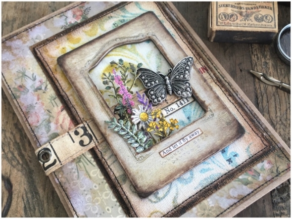
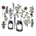
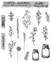
My obsession with the flower jar stamps and co-ordinating framelits dies hasn’t subsided and I am still using up the stash I made a few months ago. You can see those posts HERE, HERE and HERE.
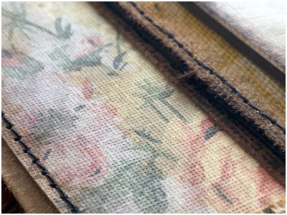
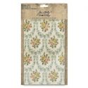
Another obsession is the idea-ology worn wallpaper. I’m still using my first pack but have 3 more on the way. Hopefully you can see the texture in this close up. Regular visitors to my blog will know I sand everything and this was no exception. Using a blending tool I added vintage photo distress ink and then spritzed heavily with water and patted dry with a towel. It creates this really cool and even more worn/washed out look. Did I mention the texture? LOVE LOVE LOVE the worn wallpaper!
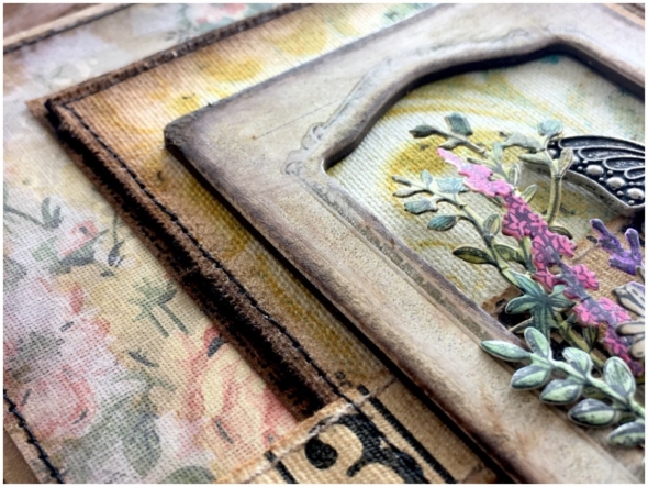
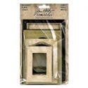
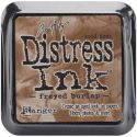
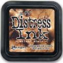
The new idea-ology baseboard frames are another favourite of mine from the new release. They come beautifully pre-weathered and even look like they have been crackle glazed. I naturally took my sanding grip to it anyway and then blended in some frayed burlap and walnut stain distress inks and wiped away the excess with a damp cloth. The ink only clings to the sanded parts as the baseboard frames have a coated finish.
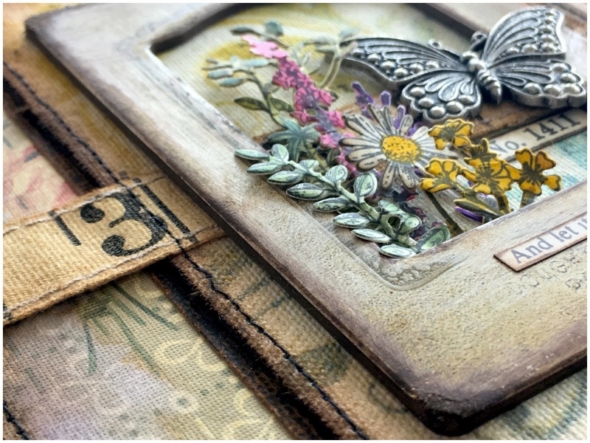
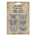
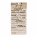
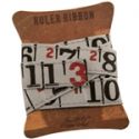
Before assembling, I ran the worn wallpaper and sticky back canvas through my sewing machine. I mounted the baseboard frame over ruler ribbon, tucked in the flowers and added a butterfly from the adornments butterflies, (all from the idea-ology range) with distress collage medium adhesive. I added a clippings sticker, being careful not to cover any of the wonderful detail on the baseboard frame.
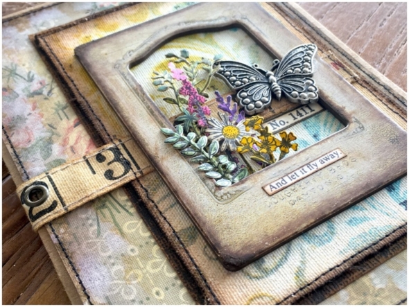
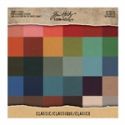
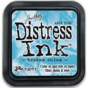
I used the Tim Holtz flourish stencil and blended fossilized amber and broken china distress inks through it onto sticky back canvas. This was mounted onto black idea-ology classic kraft stock, (sanded, of course)!
Thanks for stopping by. I hope you find some time to get creative this week.
Zoe










Gorgeous job my friend!!! Just ordered the frames and wallpaper! Love how this is put together!!! XXXOOO
Well, keep using up that floral stash because I love seeing these breathtaking projects!!! Gorgeous, GORGEOUS, gorgeous!!!!
Beautiful-love the vintage feel.
wow, this is beautiful Zoe! Love that Worn Wallpaper too (texture is everything).
This is really pretty Zoe! I bought the Flower Jar Stamps and Framelits Dies to match after seeing some of your wonderful pieces of art. Thanks for the inspiration!
So happy to see the wallpaper and frames in action on your lovely blog. I have both sitting unused on my shelf waiting for the frillies to hit me, but I can see how wonderful they look with your trademark grungy style. You have already enabled me with the flowers/framelits, and I can’t wait to use them. Thank you for your inspiration! Hugs!
Another stunning project Zoe! Love how you put it all together!
This gorgeous creation takes me right back to my Grammy’s parlor. She had faded cabbage roses on her wallpaper, and a little moon shaped niche in the wall filled with pretty things. I used to sit on her prickly couch and drink it all in. Magical…just a magical, amazing and oh, so beautiful creation with all those faded colors and wonderful textures. Thanks!!!!
Absolutely gorgeous, Zoe. x