20th July, 2020 by iGirlZoe

Hello friends
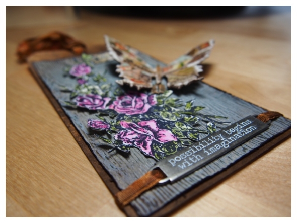
A few months ago I shared a tag on social media that I made using one of my favourite techniques from the incredible 16 weeks of demos Tim Holtz shared. If you missed any of these, you can find them all on Tim’s blog. Hands up who misses the Saturday party at Tim and Mario’s?!

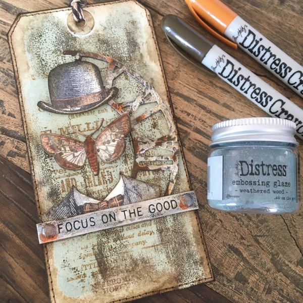
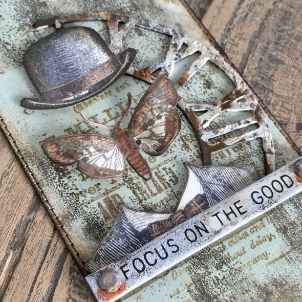
Now more than ever I think it’s so important to focus on the good and I thought it would be nice to share the tag in a little more detail, so here we go.

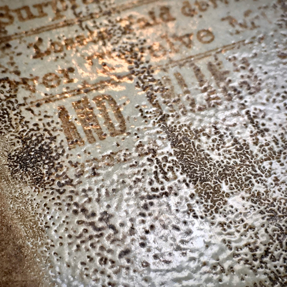
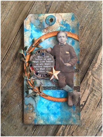
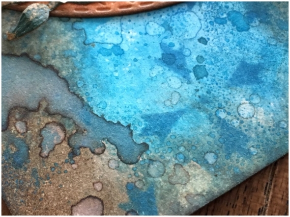
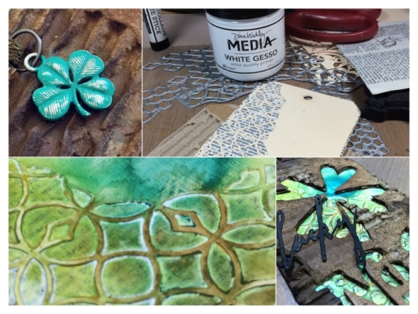
I followed Tim’s distress crayon and distress embossing glaze technique, which you can see here. I have been a long time fan of distress crayons and used with the new distress embossing glaze, WOW!! This grungy weathered effect is completely up my street and it’s so easy to do.

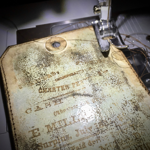
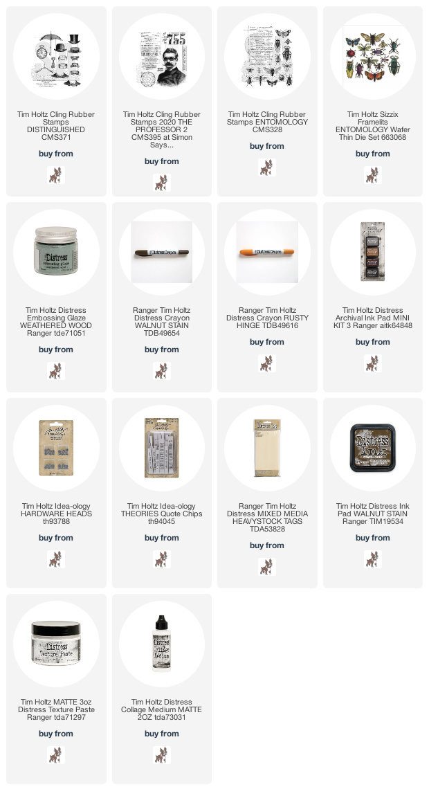
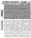
I stitched the edges of my tag with my Singer heavyduty sewing machine. Practice makes perfect with stitching and mine is definitely getting better! Tip, if you miss a stitch, (which happens to me all the time), draw it on after with a marker. The background stamp is from the professor 2 CMS395 stamp set.

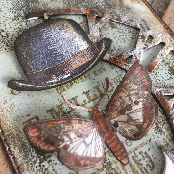
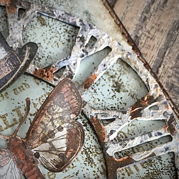
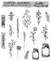
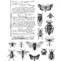
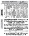
I had to add a hat, I think dapper CMS267 and distinguished CMS371 stamp sets will always have my heart, it doesn’t matter how stuck I get creatively, I break out these sets and it inspires me. Stampers Anonymous never retire Tim’s stamps so you can pick up them up from set 001 to set 406! I added a bug from the entomology CMS328 stamp set, the matching thinlits dies makes it really easy and they fit in the Sizzix sidekick.

I used part of the weathered clock (664173) bigz die cut with texture paste and distress crayon added to weather.

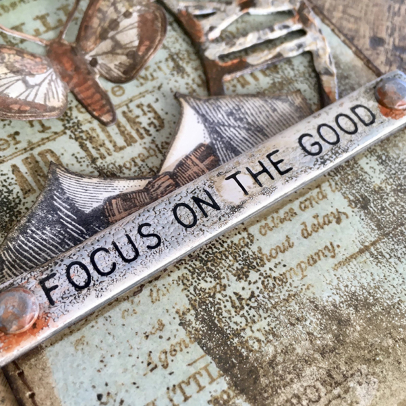
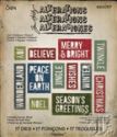
Using the same technique as linked to above, I altered this quote chip. I always remove several layers of the cardboard to make the quote lower profile. The layers separate really easily, you can do it with your finger nail. They are now longer so you can add hardware to the end. I used idea-ology hardware heads with distress crayon and a waterbrush to add a little rust effect.

Hope you have a creative week and focus on the good.
Zoe x

Category Mixed Media, Ranger Ink, Sizzix, Stampers Anonymous, Tags, Tim Holtz | Tags: | 10 Comments | Views: 2,191
16th May, 2018 by iGirlZoe
It’s Wednesday and time for the funkie side of the design team to share our projects for the current challenge over at the Frilly and Funkie Challenge Blog!
The current challenge is hosted by team member Kathy who has chosen the theme SURF’S UP! …Kathy says, “Who’s ready for a little sand, a little sun and a little surf? Let’s take this challenge for a stroll beside the shore! Create a vintage or shabby chic project with a beachy theme. Use ocean colors and beach images to add a fun seaside feel to your project.”
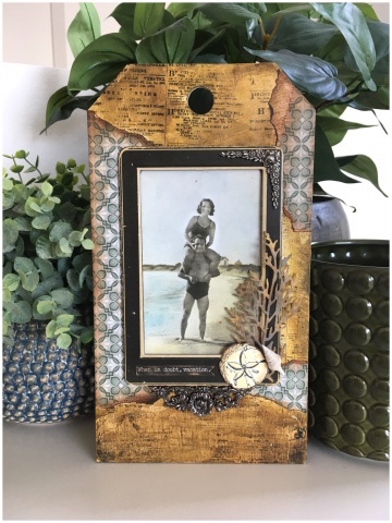
 One of the many things that I love about the beach is the beautiful scenery. So many different textures from the grainy and wet sand, breaking waves, bubbles in the tide, drift wood, sea shells, seaweed… I wanted to include texture in my project to convey this.

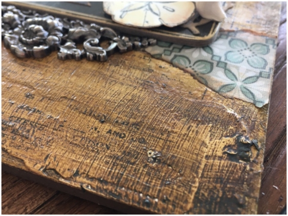
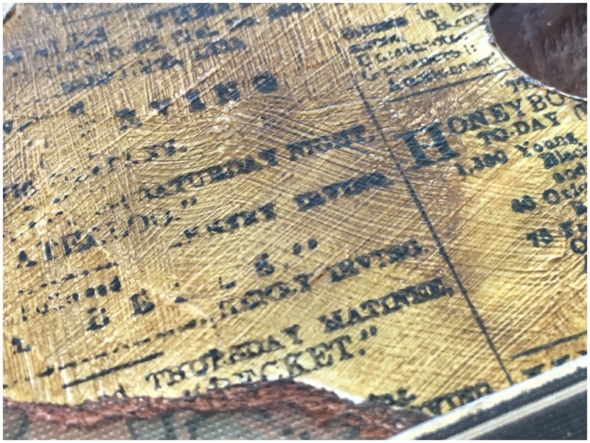
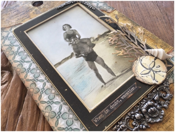
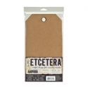
I took a medium etcetera tag from the Tim Holtz idea-ology range and covered it with white gesso using a palette knife. I was quite “hap-hazard” about it to create a nice random and uneven texture. Once dry I applied a layer of matte distress collage medium with a distress brush. This created more texture in the form of brush lines. It also gives a slightly slicker surface to push the distress crayons around.

I removed some of the distress crayon with a baby wipe to create highlights. I stamped with the newsprint stamp (CMS266). I didn’t use my Tim Holtz stamp platform this time as I wanted the stamp to misprint where the gesso was heavier.

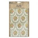
With some encouragement from my friend and design team mate Jenny, I finally used a piece from the idea-ology worn wallpaper pack! It really is almost too beautiful to use! I tore the worn wallpaper into pieces and adhered to the etcetera tag with matte distress collage medium. Blending in vintage photo distress ink and distress crayon.

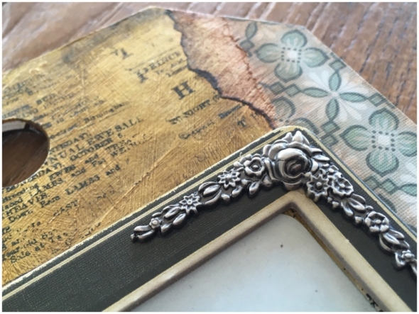
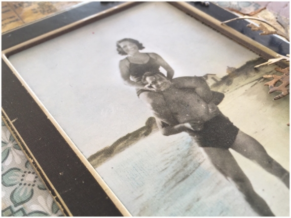
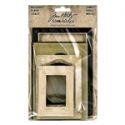
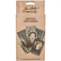
I used one of the found relatives cards, which I coloured with distress markers. I love the very subtle colour the distress markers can give on these cards, that looks as if it were once more pronounced and has faded over time. I mounted one of the new Tim Holtz idea-ology baseboard frames over the top. I didn’t alter the frame at all. Look how beautifully vintage it is straight out of the package.

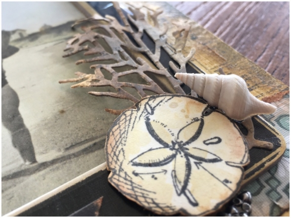
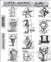
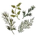
I added a stamped and fussy cut star fish from the mini blueprints #6 stamp set (CMS196) and painted using antique linen distress ink and a water brush. I also added a die cut from the Tim Holtz Sizzix Holidays Green thinlits die set and a shell I collected from the beach.

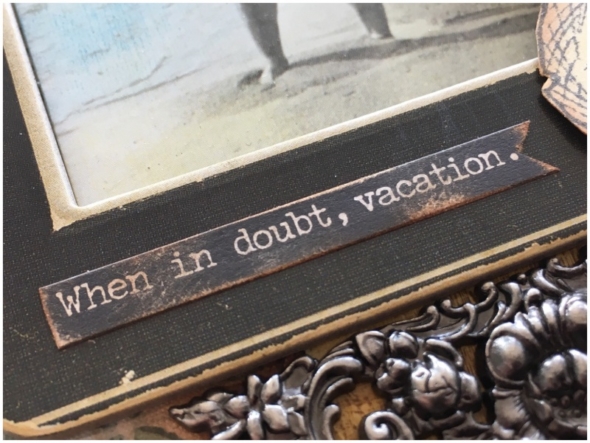
This was the perfect sentiment for my tag using a sticker from the snarky small talk stickers set. This is definitely a motto I personally follow! 😉

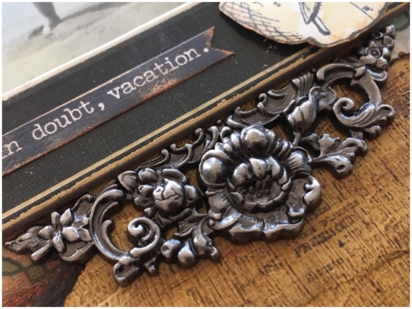
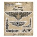
This new idea-ology vignette accent was the perfect accent for the base of the baseboard frame. I’m going to need more of these, they are simply gorgeous!

An alternative idea would be to use one of your own holiday snaps in place of the found relatives card. I am going to hang this as a home decor piece for the summer.
Thanks for stopping by. I hope you will find time to join in the challenge and pop over to Frilly and Funkie challenge blog to see the rest of the DT’s projects. All the products I used are available from The Funkie Junkie Boutique.
Zoe

Category DT, Frilly & Funkie, Ideaology, Sizzix, Stampers Anonymous, Tags, Tim Holtz | Tags: | 7 Comments | Views: 622
2nd May, 2018 by iGirlZoe
It’s Wednesday and time for the funkie side of the design team to share our projects for the current challenge over at the Frilly and Funkie Challenge Blog!
The current challenge is hosted by team member Sara Emily who has chosen the theme NEUTRAL POINT OF VIEW …Sara Emily says, “We’re seeing a lot of pastel and brighter colors this time of year. For this challenge we’re inviting you to step away from all that color and play with your neutral art supplies. You can add a few pops or hints of color, but be sure we see mainly neutrals on your vintage or shabby chic design. (Think black, white, gray, brown, beige, cream, ivory; even gold and silver.)”
 Okay, so this challenge was much easier for me than the last one. Neutral, (BROWN), is a colour palette I LOVE.

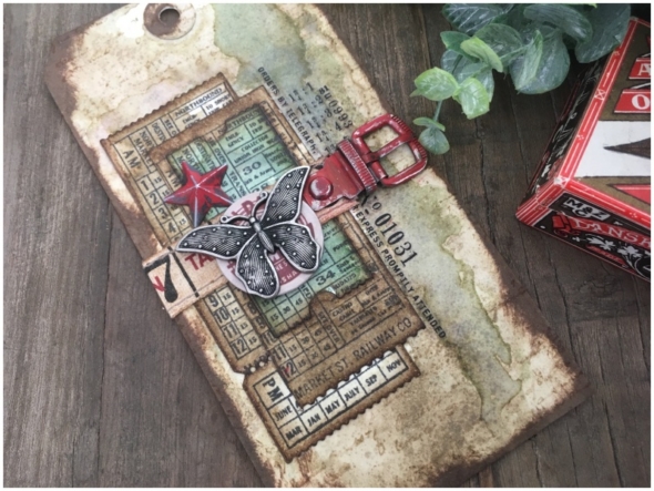
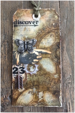
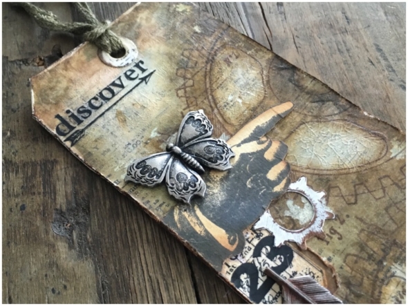
I used the distress crayon layered colouring technique from Tim Holtz Creative Chemistry 103 online class, with the addition of distress collage crazing medium over the top. I used dapper (CMS267) and newsprint (CMS266) stamps for the background and added a remnant rub.

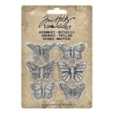
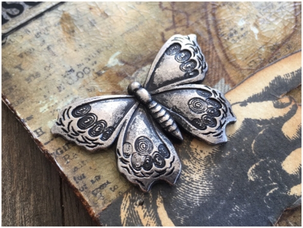
I am in love with the new idea-ology adornments butterflies! There are all sorts you can do to alter them but this time it needed the simplicity of being natural.

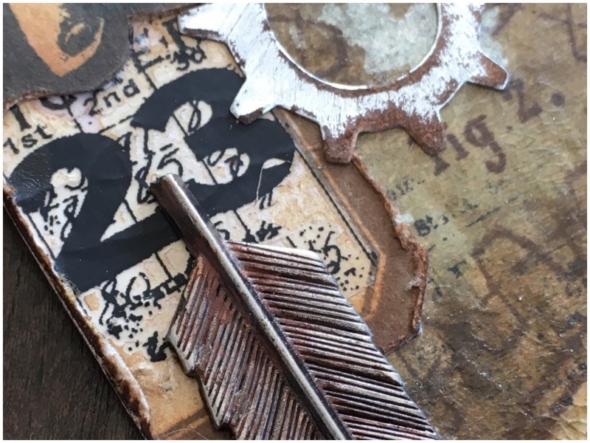
I also added a vial label with remnant rubs over the top and a die cut gear from metallic kraft stock and sanded. Both blended with walnut stain distress ink and adhered with distress collage matte medium. I added the bow end of an idea-ology adornments arrow.

Thanks for stopping by. I hope you will find time to join in the challenge and pop over to Frilly and Funkie challenge blog to see the rest of the DT’s projects. All the products I used are available from The Funkie Junkie Boutique.
Zoe

Category DT, Miscellaneous, Tags, Tim Holtz | Tags: | 13 Comments | Views: 664
18th April, 2018 by iGirlZoe
It’s Wednesday and time for the funkie side of the design team to share our projects for the current challenge over at the Frilly and Funkie Challenge Blog!
The current challenge is hosted by team member Cec, who has chosen the theme ELEGANT JEWELS …Cec says, “Let’s make a vintage or shabby chic project in jewel tone colours such as deep purple, emerald green, jade green, burgundy, bright turquoise to name a few AND to make your project extra special, add some sort of jewel or gem, which can be anything from a dollar store find to a piece of broken jewelry.”
 Confession, I had to message one of my design team mates to ask for an explanation of jewels tones, (in distress colour terms of course)! Horrified at the total lack of muted brown tones I went about trying to figure out ways to add brown! Ha Ha (true story)!

I used mermaid lagoon distress oxide to simulate lagoon blue tourmaline gemstones. I added oxide to my glass media mat, spritzed with water and dragged a distress mixed media heavystock tag through, drying with a heat tool. I then went back and tapped parts of the tag into the beads of oxide on the mat. I blended mermaid lagoon distress oxide through a stencil with a blending tool and added walnut stain to the edges…
There was a helpful suggestion to use walnut stain (at the edges). I decided “edge” is a relative term and could mostly cover all those hideous brights with brown! It will be no surprise to you that I wear brown tinted sunglasses, similar to rose tinted, I see the world through a beautiful brown lens. 😉

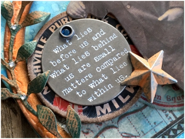
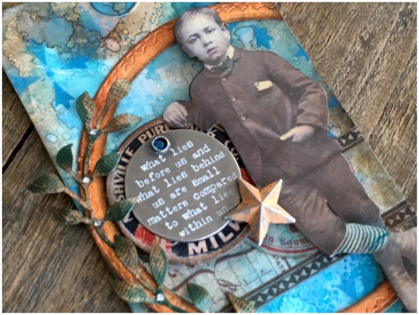
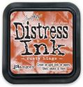
I am so obsessed with the new idea-ology milk caps by Tim Holtz that I had to talk myself into covering it up with an idea-ology quote token. I added picket fence distress crayon to the quote token and a rhinestone gem to the hole, with stonewash alcohol ink added. A little rusty hinge distress paint was added to the idea-ology adornment stars, (still one of my favourites) and everything glued into place with distress collage medium.

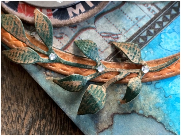
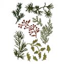
I used my sidekick to cut some foliage from classic kraft stock and sanded with a sanding grip. I added rhinestone gems to compliment the challenge theme. These were mounted over the outline of a stitched circle, coloured with rusty hinge distress ink and over a strip of design tape. I want to add that I had the stitched circle leftover from another project and wouldn’t have added the foliage if it wasn’t so easy to do so with the sidekick. I so often add die cuts where I wouldn’t if I had to get my full size die cutter out.

I added a paper doll, coloured with distress markers.
Thanks for stopping by. I hope you will find time to join in the challenge and pop over to Frilly and Funkie challenge blog to see the rest of the DT’s projects. All the products I used are available from The Funkie Junkie Boutique.
Zoe x

Category DT, Frilly & Funkie, Sidekick, Sizzix, Tags, Tim Holtz | Tags: | 14 Comments | Views: 697
7th December, 2016 by iGirlZoe
It’s Wednesday and time for another challenge over at Frilly and Funkie Challenge Blog! This is the last challenge for the year.
This challenge is hosted by Kathy (Kathy by Design), who has chosen the theme HOME FOR THE HOLIDAYS …KATHY says, “Let’s get ready to Deck the Halls by creating some home decor for the holiday season. You can make centerpieces, wreaths, banners, ornaments, wall hangings, or little vignettes …basically anything BUT a card for this challenge. If you don’t celebrate Christmas or Hanukkah or Kwanzaa, then just make some home decor with a wintry theme.”

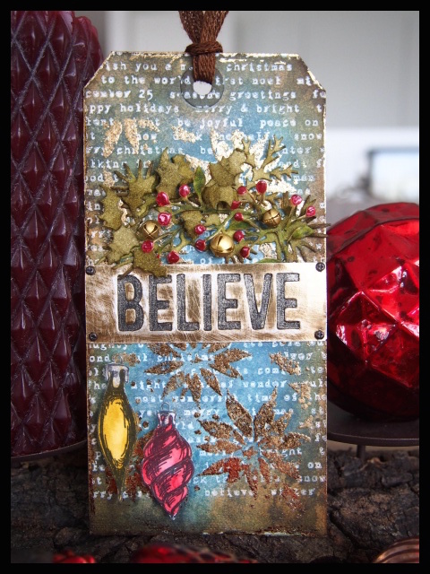
This final challenge theme is really fitting, as I will actually be going “home for the holidays!” With so much to do before we go, I decided to make some gift tags to adorn my gifts this year. I will be back on Saturday with a step-by-step for this gift tag.
Thanks for stopping by. I hope you will find time to join in the challenge and pop over to Frilly and Funkie challenge blog to see the rest of the DT’s projects. All the products I used are available from The Funkie Junkie Boutique.
The Frilly & Funkie Design Team will be back in the new year with a brand new set of challenges and I’m delighted to be joining the Design Team for another term. Wishing you all a happy holiday season.
Zoe x

Save
Category Christmas, DT, Frilly & Funkie, Tags, Tim Holtz | Tags: | 5 Comments | Views: 519
3rd August, 2016 by iGirlZoe
It’s Wednesday and time for another challenge over at Frilly and Funkie Challenge Blog!
This challenge is hosted by Kathy (Kathy by Design), who has chosen the theme BY THE SEA …Kathy says, “It’s summertime, and our minds turn toward the shore where we find sparkling sands, delicate shells and refreshing breezes. This sets the theme for our latest BY THE SEA challenge. Let’s take a virtual beach trip by creating any kind of vintage or shabby chic project that features a nautical or beach theme and color palette..”
 This is the perfect challenge to return to the Frilly and Funkie design team after taking a break for a few months to move.

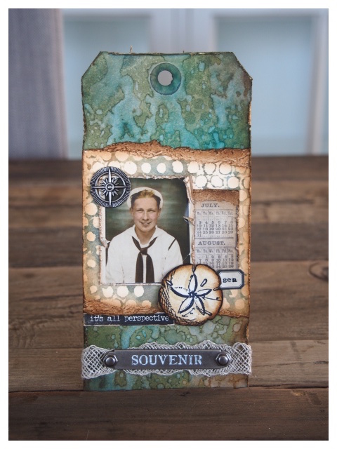
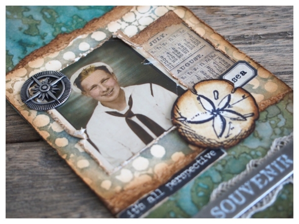
Our new harbour view inspired the tag I’ve made for this challenge.

This idea-ology photo booth photo reminded me of a summer tradition here in Denmark, where the graduating students ride around town on the back of a float wearing white graduation caps celebrating their success with their class.

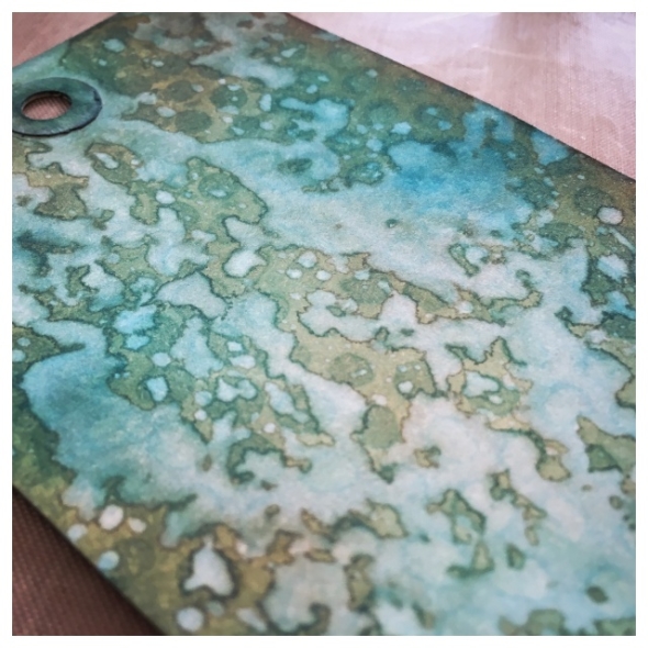
I used a spritz and flick technique that I learned from taking Tim Holtz’s Creative Chemistry 101 online class for my tag base.

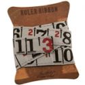
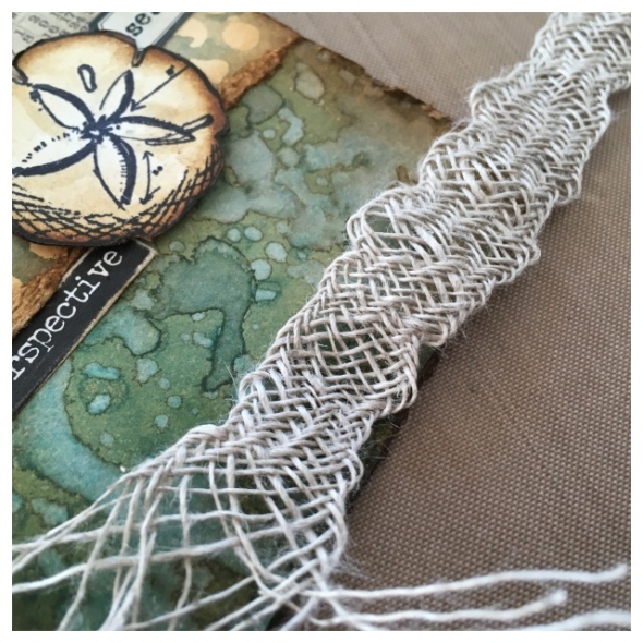
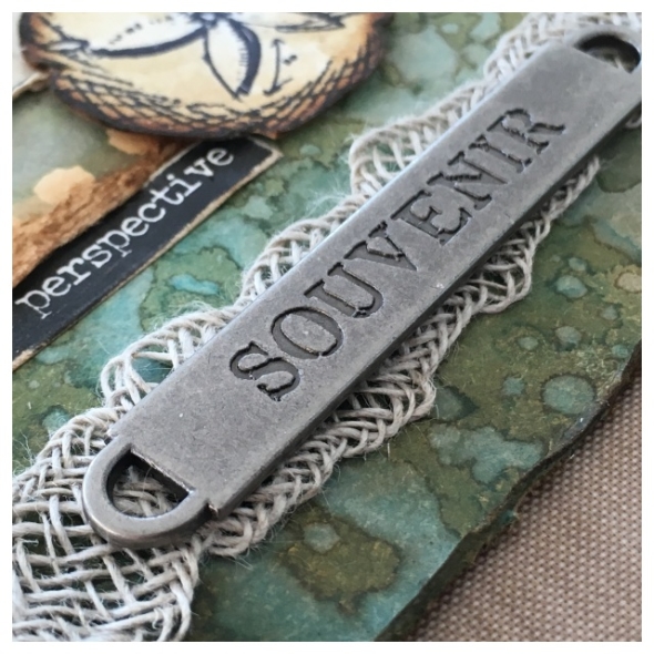
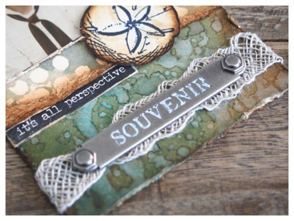
I love the versatility of this linen ribbon. By pulling and working it with your fingers you get this cool net look. Usually I would blend some distress ink over the top, but this time I left it natural to look like fishing net.

I added a word band, but it was begging to be distress crayoned!

It is SO much easier to add distress crayon than paint over the word bands, literally a 5 second job. I love how it makes the word bands pop and by rubbing gently with some kitchen paper you get this cool distressed look.
Thanks for stopping by. I hope you will find time to join in the challenge and pop over to Frilly and Funkie challenge blog to see the rest of the DT’s projects. All the products I used are available from The Funkie Junkie Boutique.

Save
Save
Category DT, Frilly & Funkie, Tags, Tim Holtz | Tags: | 7 Comments | Views: 407
29th April, 2016 by iGirlZoe
I really do love the techniques used in this month’s 12 tags of 2016 by mix master Tim Holtz! So much so, that I had a third go at making something using the remixed techniques.

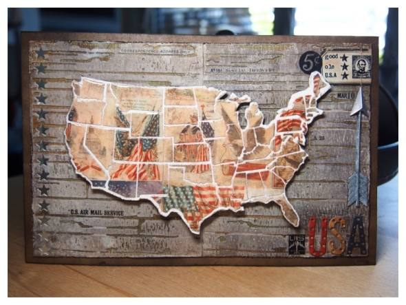
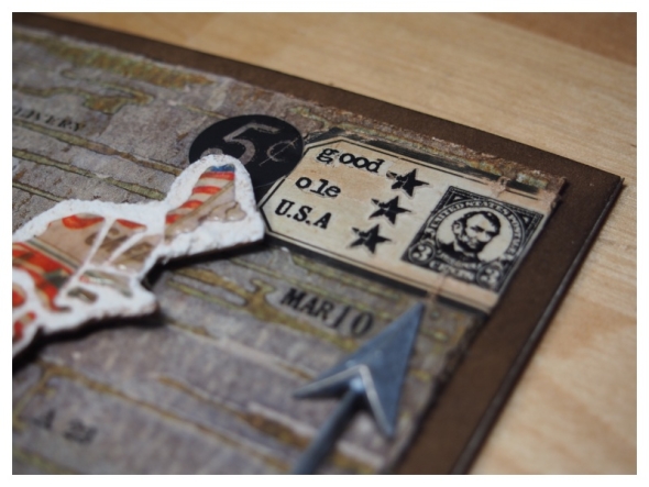
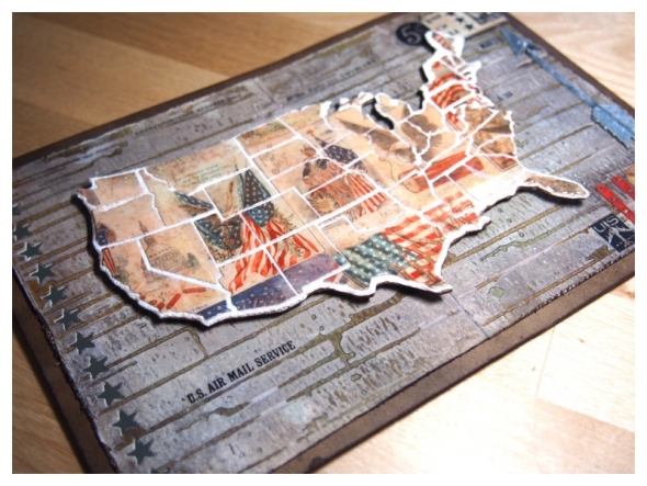
Something a friend said about the “good ole usa” inspired this post. There’s clues about this person on the project! It’s someone you’ll know! 😉

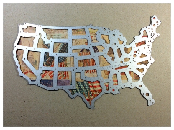
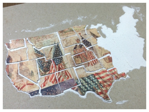
I die cut a sheet of Americana images from the seasonal paper stash with the United States thinlits die.

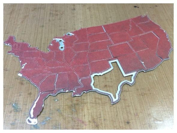
When you have run your die through the die cutter, keep the cutting plates together and flip over and slide the die off the plate. The individual states remain in the die which will make it easier later.

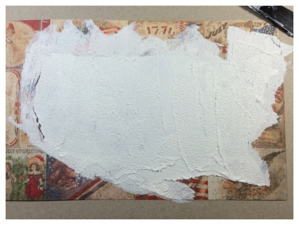
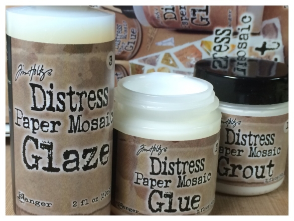
I used the leftover paper which I die cut the USA from, as a stencil. Spread the grout from the mosaic kit through with a palette knife onto chipboard.

I carefully placed each state onto the dried grout using the distress mosaic kit. I worked in sections leaving small gaps between each piece. Once completely dry, I fussy cut around the USA map and put 3D foam on the back ready to mount onto my background.

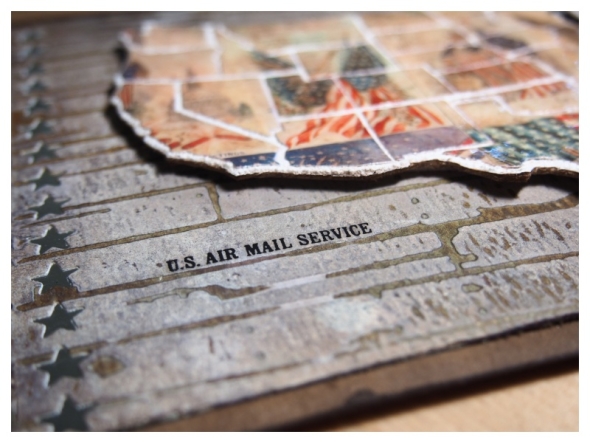
I embossed two pieces of distress watercolor cardstock with one of Tim Holtz’s texture fades folders and taped together at the back. I followed the techniques on Tim’s blog as with the woodgrain cardstock. I die cut shape strip stars into the side and under-mounted metallic kraft core. I mounted onto chipboard backed kraft cardstock and covered in walnut stain distress stain.

I added a vial label, remnant rubs and an adornment arrow covered in picket fence distress paint.

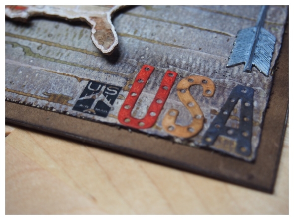
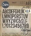
Finally, I added “USA” which I die cut from the new alphanumeric marquee die set from distress watercolor cardstock and covered with distress inks.

Thanks for stopping by, you can see all the techniques for this months tag on Tim’s blog.

Category 12 Tags 2016, Tags, Tim Holtz | Tags: | 28 Comments | Views: 1,945
3rd April, 2016 by iGirlZoe
Hope you’re all having a wonderful weekend. I’m sharing my version of this month’s Tim Holtz 12 tags of 2016.


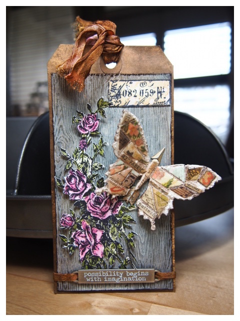
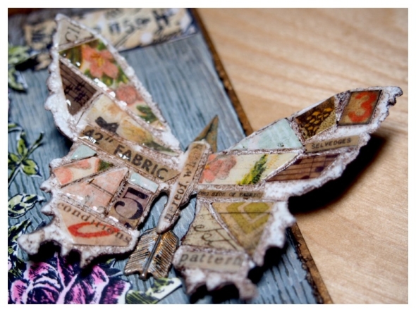
I’ve had the distress mosaic kit for a while but hadn’t taken the plunge before now because of an irrational fear of uneven shapes. I’m a Tetris wizard, but disordered shapes make me want to straighten stuff… Okay, let’s underplay the craziness. 😉

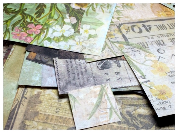
Once I got started I was cutting my paper scraps at the weirdest angles! Figuring out how to fit them together was so fun, like a disordered jigsaw puzzle.

I removed most of the distress ink from the butterfly as I LOVE the exposed grout. Who knew white could be so grungy?! I’m hooked!

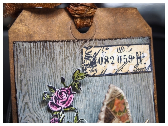
The technique that Tim uses on the new woodgrain cardstock is AH-MAZING! It’s SO simple and SO effective. See the technique here…

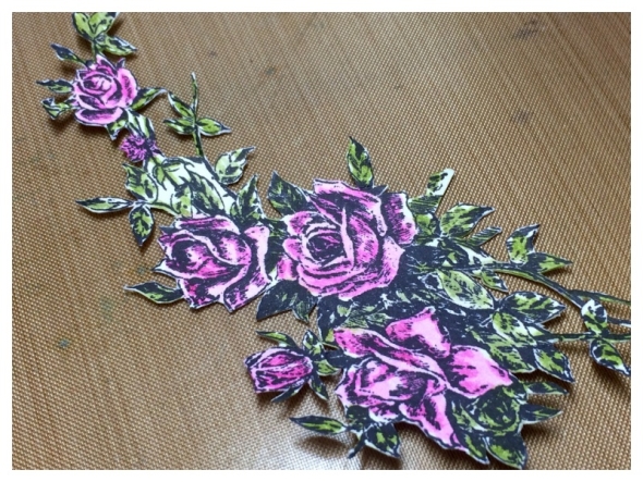
I used the new lady rose stamp set! I stamped, fussy cut and watercoloured with distress markers.

Thanks for stopping by, you can see all the techniques for this months tag on Tim’s blog.

Category 12 Tags 2016, Tags, Tim Holtz | Tags: | 21 Comments | Views: 939
17th March, 2016 by iGirlZoe
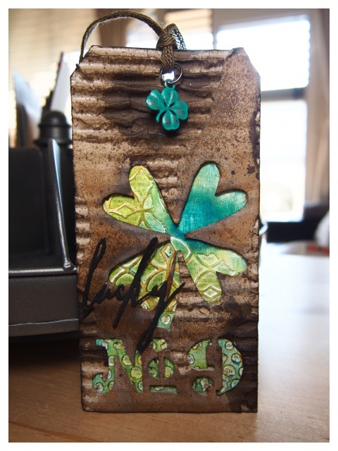
Happy St Patrick’s Day! I’m celebrating early with an extra shot of espresso in my morning coffee and my take on March’s 12 tags of 2016 tag.


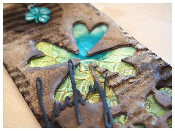
I used a heart from the Tim Holtz mini hearts movers and shapers die set to cut the four leaf clover. I freehand cut the stem. I can’t even begin to tell you how scary freehand cutting is for me! I’m totally a “right tools for the right job” kind of crafter!

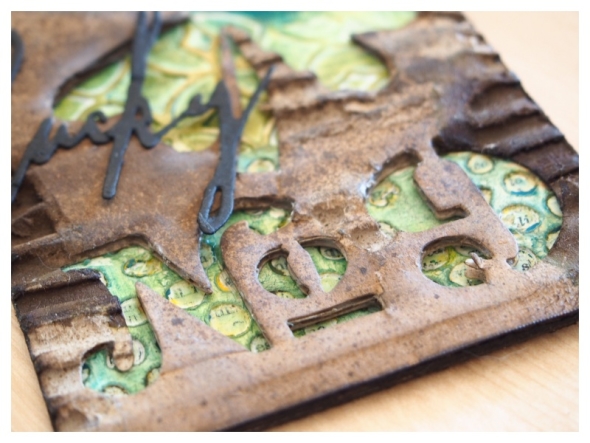
The “No 9” are die cut with the Tim Holtz cargo numbers die set, (one of my favourite die sets of all time)! The “9” is the number of the apartment we are lucky enough to be moving to in Copenhagen’s North Harbour in June.

Thanks for stopping by, you can see all the techniques for this months tag on Tim’s blog.

Category 12 Tags 2016, Tags, Tim Holtz | Tags: | 12 Comments | Views: 484
